In today’s digital age, ecommerce has emerged as a cornerstone of modern retail, revolutionizing the way businesses operate and consumers shop. With the click of a button, customers can explore vast product catalogs, compare prices, and make purchases from the comfort of their homes. However, the success of an ecommerce venture hinges not only on its online presence but also on its ability to harness data effectively.
Ecommerce analysis plays a pivotal role in understanding customer behavior, optimizing marketing strategies, and maximizing profitability. By delving into key metrics such as sales trends, customer demographics, and conversion rates, businesses can uncover valuable insights that drive growth and competitive advantage. From identifying top-performing products to fine-tuning website design for enhanced user experience, ecommerce analysis empowers organizations to make data-driven decisions that resonate with their target audience and propel them towards success in the digital marketplace.
Data Source:
I am grateful to acknowledge that the dataset was obtained from a You Tube channel ” Rishabh Mishra” guiding beginners how to use Power BI . The dataset was well documented and clean, it consists of 2 tables named “Details” and ” Orders”. The Details table consists of 1501 rows and 7 columns whereas the Order table consists of 501 Rows and 5 columns. In Order table the field name Order Date hold the data type of “text” which I converted into “Date” data type in Data view of the Power BI after which it created the date hierarchy automatically.
Data view of table Details:


 Objectives and Key Insights:
Insightful Visualization: Dynamic charts and graphs provide a comprehensive view of sales performance across regions, categories, and customer segments.
User-friendly Interface: Intuitive design ensures ease of navigation, making data analysis accessible to all stakeholders.
Actionable Analytics: From state-wise sales breakdowns to detailed profit analysis by month and sub-category, this dashboard equips businesses with the information they need to drive growth.
Key Metrices and Visualizations:
Followings are the charts I used to visualize my Insights with descriptions:
Profit by Month:
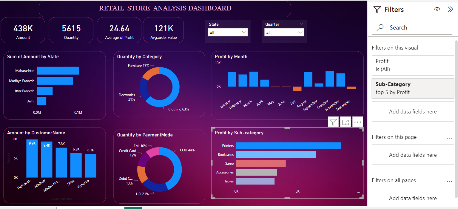
I used Stacked column chart to show the profit gained over months. Each bar represents the profit generated in a specific month, with the height of the bar indicating the magnitude of profit. The chart enables viewers to quickly assess variations in profitability across different months, highlighting periods of growth or decline. Additionally, the color differentiation between bars may signify positive (blue) or negative (orange) profit values, aiding in the visualization of overall performance trends. We can see that the profit generated in months of May, June, July, and December is equal to none.
Profit by Sub-Category:
To visualize this , stacked bar chart is used, and to show which sub-category made the business more profit, filter is applied. I chose advance filtering in the filter pane to show which top 5 sub-categories are making the most profit.

Here we can see that we had top 5 sub-categories in the highlighted visual among the all sub-categories that are Printers , Bookcases, Saree, Accessories, and Tables respectively in the order, which are making us more profit and even two of them on the top are making it more than five thousands.
Amount by Customer Name:
This Stacked column chart provides a breakdown of the total amount spent by different customers. Each bar represents a customer, with the height of the bar indicating the total amount spent by that customer. This visualization allows for a quick comparison of spending behavior across different customers, identifying top spenders and their respective contribution to overall revenue. I also applied the filter to show that which are our top customers who likes to spends a lot of money on purchasing from the store.

the above highlighted chart shows the sum of Amount spend by each customer and to narrow down the information filter is being applied. It restricts the visualization to display data for the top 5 customers based on the amount they have spent. So they cold be facilitated in any way like giving them coupon , and can be provided with a card from which they could be able to buy each and everything with special customer discount. Additionally, the filter provides options to sort the customers by the amount spent in ascending or descending order, providing flexibility in data exploration.
Sum of Amount by State:
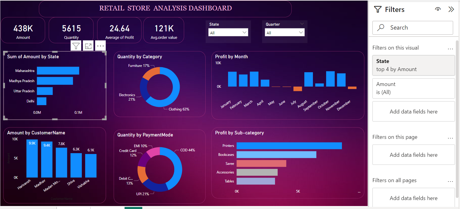
To drive insights and information about the sum of Amount generated from the different states, to see which states gives our business a boost ,stacked bar chart is used. In the filter pane the State filter is set to display the top 4 states by the total amount spent. The filter type is Advance Filter or “Top N”, and it shows the top 4 states based on the total amount spent. This filter helps to focus the analysis on the states that contribute the most to the revenue.

The highlighted Chart in the Report can be illustrated as Sum of Amount by State and in the filter pane , filters of Top N is applied to demonstrate which states contributed the most in the revenue generation.
Quantity by Category :
To visualize Quantity by Category I used the Donut chart presenting a breakdown of the total quantity of products sold across different categories. Each segment of the donut chart represents a product category, with the size of the segment proportional to the percentage of total quantity attributed to that category. The chart visually depicts the distribution of sales among various product categories, highlighting the relative popularity of each category. In this instance, clothing accounts for the majority of sales with 63%, followed by electronics with 21%, and furniture with 17%. This visualization aids in understanding customer preferences and can inform inventory management and marketing strategies accordingly.
Quantity by Payment Mode :
The “Quantity by Payment Mode” chart provides an overview of the distribution of product purchases across different payment modes. Each segment of the Donut chart represents a payment mode, with the size of the segment indicating the proportion of total quantity attributed to that payment mode. The chart visually highlights the popularity of various payment methods among customers. In this instance, Cash on Delivery (COD) is the most preferred payment mode, accounting for 44% of total quantity, followed by Unified Payments Interface (UPI) with 21%, Debit Card with 13%, Credit Card with 12%, and EMI with 10%. This visualization offers insights into customer payment preferences, which can inform payment processing strategies and facilitate smoother transactions for customers.
Cards and Slicers:
Cards like these indicates valuable information like the Sum of total Amount generated by Sales , Quantity of the products sold and Profit generated from Sales. The Card Avg. order value provides the information that how many orders we got by dividing the Amount generated by selling different products over Quantity of the products sold. Since that column was not provided so in order to show the information I calculated the column in the Details table .
Slicers:
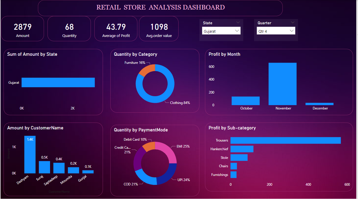
Here I used two slicers , State and Quarter , where I could see the effects of these filters over visuals, like if a particular state and Quarter is selected, different valuable insights can be generated like the profit generated in that specific state in that specific region and many more. Just like the below mentioned figure.

So here I applied the filter of “State: Gujarat” and “Quarter: Qyr4” and very valuable insights were generated about the Amount generated through the Sales, Quantity of the products sold in the Gujarat in Qtr 4, Profit generated in specific Months and can be seen that the most of the profit generated in November, Top 5 sub-categories which makes the most of the profits are Trousers, Handkerchief, Stole, Chairs and Furnishings. Talking about the Quantity by Category and Payment Mode it can be interpret clearly that Furniture and Clothing Categories are the most sold in Gujarat and EMI is the most used Payment Mode in the state. For Top 5 Customer who have spend the most Amount in purchasing products from the store are Dashyam, Suraj, Saptadeep, Moumita and Gunjal.
So it was my dashboard report for Ecommerce Analysis of Madhav Store to produce valuable insights like
Sales Performance Evaluation: Assessing the overall sales performance of the ecommerce platform to identify areas of strength and opportunities for improvement.
Customer Behavior Analysis: Understanding customer preferences, purchasing patterns, and demographics to tailor marketing strategies and enhance customer satisfaction.
Product Analysis: Evaluating the performance of individual products or categories to optimize inventory management, pricing strategies, and product assortment.
Forecasting and Planning: Utilizing historical data and trend analysis to forecast future sales, anticipate demand fluctuations, and make informed decisions regarding inventory management and resource allocation.
Overall, the objectives of the Retail Store analysis project are geared towards maximizing profitability, improving customer experiences, and maintaining a competitive edge in the dynamic ecommerce landscape.


