Completing this project made me feel more competent in using Power BI to turn raw data into actionable insights, and it has truly fueled my passion for analytics. I was facing a lot of challenges in Data Modeling and DAX particularly but this project alongside with business scenarios helped me a lot overcoming my fear and it rises up my confidence to dive into this field and to transform my simple looking dashboard report into an impressive & interactive dashboards.
The project was a business intelligence assignment, where the management of a global manufacturing company that produces cycling equipment and accessories wants to track it’s key performance indicators (sales, profits, revenues and returns).
The goals were to;
- Compare regional performance.
- Analyze product level trends
- Identify high value customers.
I used Power BI to connect and transform the raw data, to build relational data models, to create calculated columns and measures using DAX and finally to design an interactive dashboard for visualization. That is a highly summarized overview of what I interacted with, and the course combs through the entire Power BI interface thoroughly.
The dashboard had four pages, one for the executive team, one that had the geographical data, one that analyzed the products and finally a page for the customers.

This page provides an overview of Adventure Works’ financial and operational metrics, highlighting total revenue, profit, orders, and return rate. It includes a revenue trend graph over time, a breakdown of orders by product category, and a table showcasing the top 10 products by orders, revenue, and return rate. There are also visuals for monthly revenue, orders, and returns against set targets, as well as key metrics on the most ordered and most returned products. This page is linked to Product Details page via cross report filtering on ‘Product Name” field from Product Overlook Table.
So if you right click on any product from Product Table on this page , it will give you and option to drillthrough it to Product details Page and it will provide you with every detail related to that particular product.

Geographical Analysis: This page displays a world map showing the total orders by country. Users can filter the data by different regions, such as Europe, North America, and the Pacific, allowing for an analysis of sales distribution across various locations.

That’s what I was talking about in earlier section , that how I clicked on the Road Tire Tube product category from that “Top 10 Products” table from Executive Dashboard and it drillthrough it and give details of that particular product. It also includes a slider for price adjustments Numeric Parameter and trend lines for total and adjusted profit. Additionally, it shows return rate trends, allowing users to examine return details over time, and provides options to view other product-related metrics like total orders, profit, and revenue using Fields Parameters.

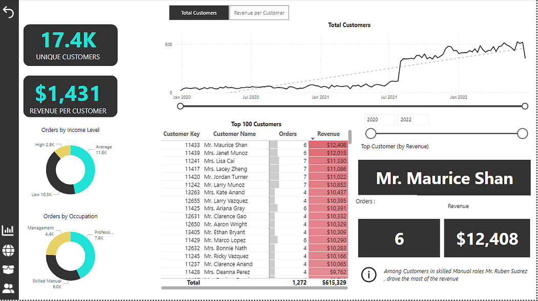
This Page provides a comprehensive view of customer revenue data, highlighting key metrics and visual insights. The left panel showcases two main KPIs: 17.4K unique customers and $1,431 revenue per customer. It also includes pie charts depicting orders segmented by income level and occupation. The central area features a line chart illustrating the growth trend in total customers over time, with a detailed table of the top 100 customers sorted by revenue. To the right, a card displays Mr. Maurice Shan as the top customer with 6 orders totaling $12,408 in revenue. A footnote calls attention to Mr. Ruben Suarez from the skilled manual group as a significant revenue driver.
Additionally navigation bar and buttons are used for navigation purposes.
So that was the brief but detailed overview of the dashboard which helped me alot gaining alot of confidence over my skills and courage to sharpening them.